

Logo represents your company's image or "mission". A half-arsed logo writing their full name company there is just a bad move. You see all time great watches, they all have iconic logo that is timeless. Like Omega, etc. It encompasses other industries, like car, football teams, etc.
Imagine if Bayerische Motoren Werke AG is spelling its brand as logo.
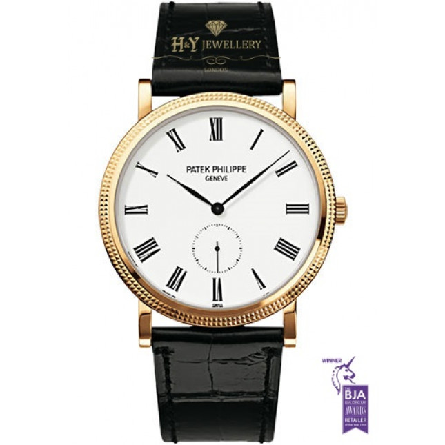
Although in the grand scheme of things, it isn't THAT important. But it's aesthetically annoying.

As you may have noticed, we we're offline this morning. This was caused by the "Thanks" plug-in going rogue and using up way too many server resources. This triggered an automatic suspension by our hosting provider as they thought it was a malicious attack. The "Thanks" plug-in has been disabled, hopefully temporarily so I can determine if that was indeed the cause, and take steps to prevent it from happening in the future.
I apologize for the disruption and for any confusion that may have caused.
Logos - Let's Discuss
Re: Logos - Let's Discuss
Like between these two. The Omega logo make the watch more pleasing to the eye than a mere word typing.

Re: Logos - Let's Discuss
I refused to buy a CW watch for a while because of the boring logo and 9 o'clock placement. Then I bought a bronze Trident on a NN deal because I wanted a bronze and blue watch. The watch quality really impressed me and I found that I didn't even pay attention to the logo. I even bought another Trident, SS with white dial.
Although the logo isn't great, it's not something I ever really notice, and neither does anyone else. It hasn't stopped the bronze and blue from being the most complimented watch I own.
However, my advice to CW would be to use CW as their logo, probably with a serif typeface. Similar to how the International Watch Company uses IWC, it streamlines a complicated name into something simpler on the dial. I think they had that to begin with, but with a strange large C and small W. I think reverting to CW but with equal sized letters could work well.